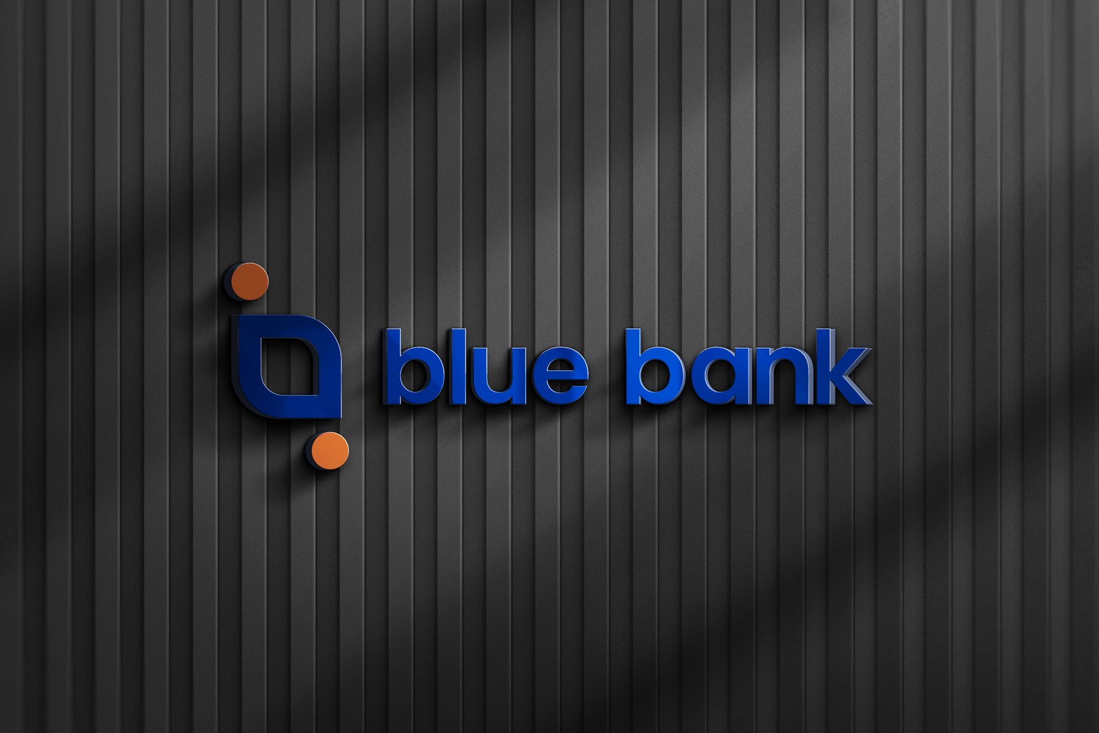

The main logo consists of an icon and a wordmark. Our wordmark is minimal and sharp.
The logo is well made and proportionately built. the icon has its own meaning behind it.
The logo icon carries the AMBIGRAM concept. That is, if it is rotated 180 degrees, this logo will not change, still forming the letter B. This indicates "infinity Growth" to continue to grow without reducing Blue Bank's brand value to provide the best to customers.
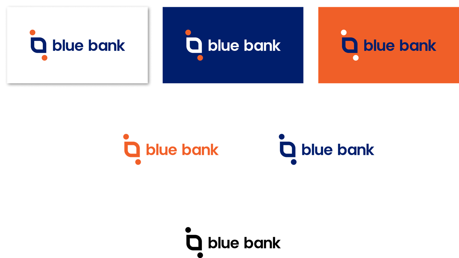
We use blue to represent reliable, trustworthy and responsible. with orange color to show determination, enthusiasm, success and happiness.

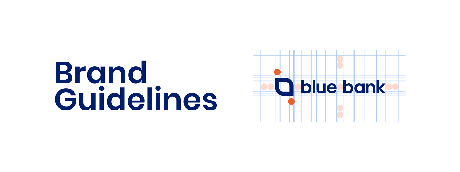
The small on the top left or bottom right of the logo should be considered as a reference for measurement.
That circle is measured 1x
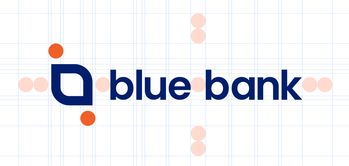
2x amount of space should the exclusion zone. it is pohibited to use any sort of artwork, typography or any other graphical artifacts between this 2x exlusion zone.


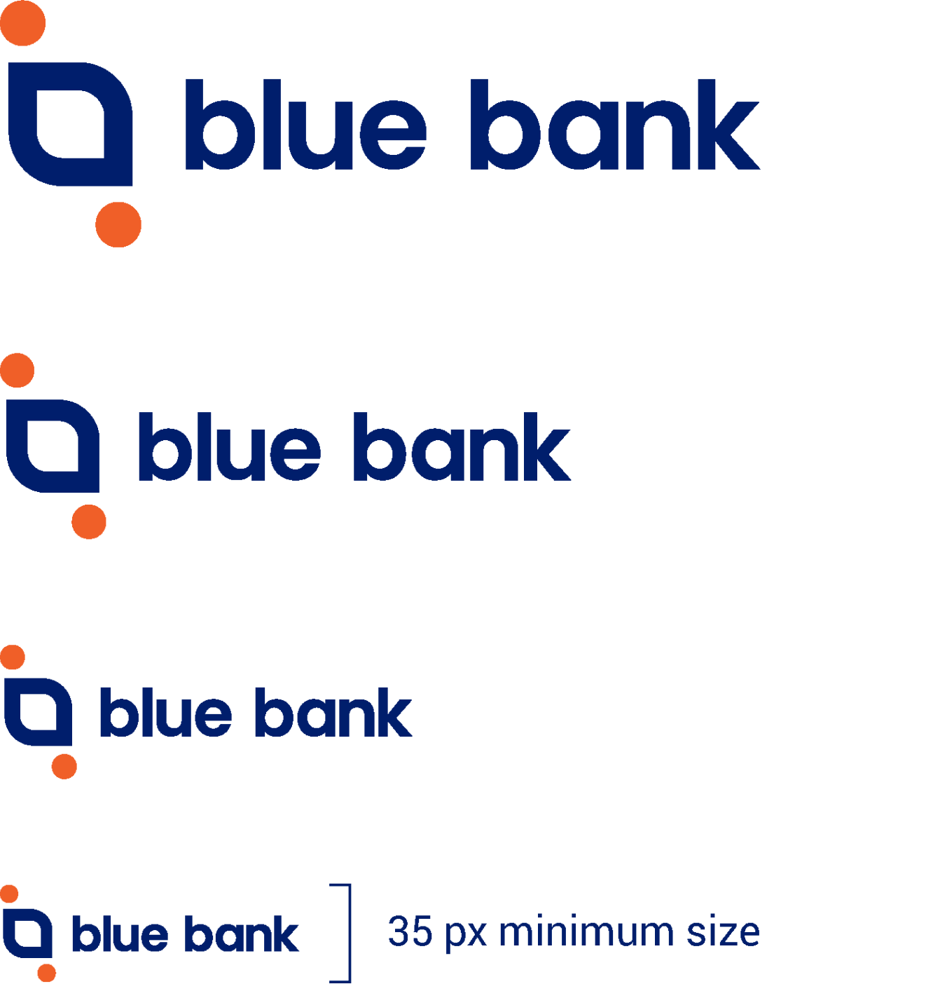
35 px is the minimum size of Blue Bank Logo.



The main typeface is poppins for both presentation and google slides.
Aa Bb Cc Dd Ee Ff Gg Hh Ii Jj Kk Ll Mm Nn Oo Pp Qq Rr Ss Tt Uu Vv Ww Xx Yy Zz
~ ! @ # $ % ^ & * ( ) _ - + = { } [ ] | \ ; : “ ‘ < > , . ? /
Our tagline should always be in Roboto Bold While using it as a headline.
Roboto Bold

